Heart of Asia.
Design
Dave Joseph Santos
Services
Broadcast Design
Date
June 2023
Team
Dave Joseph Santos – Art Director
Malu Buena – Copywriter
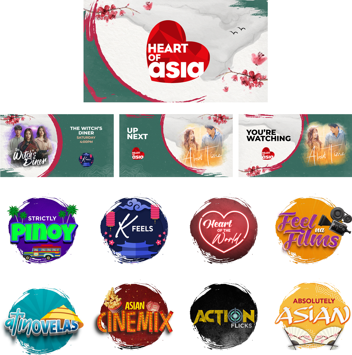
The Heart of Asia Channel for GMA Network, Inc.’s broadcast identity design is a captivating and culturally rich visual experience that reflects the channel’s commitment to showcasing the diverse and vibrant cultures of Asia.
Breaf & idea.
Color Palette:
The color palette draws inspiration from the landscapes of Asia, featuring a harmonious blend of earthy tones, deep blues, and vibrant reds. These colors not only evoke a sense of cultural richness but also create a visually appealing and calming atmosphere for viewers.
Typography:
The typography is carefully chosen to represent the modern and traditional aspects of Asian culture. A fusion of clean, sans-serif fonts and ornate, script-style lettering is used for on-screen graphics and captions, ensuring readability while adding an artistic touch.
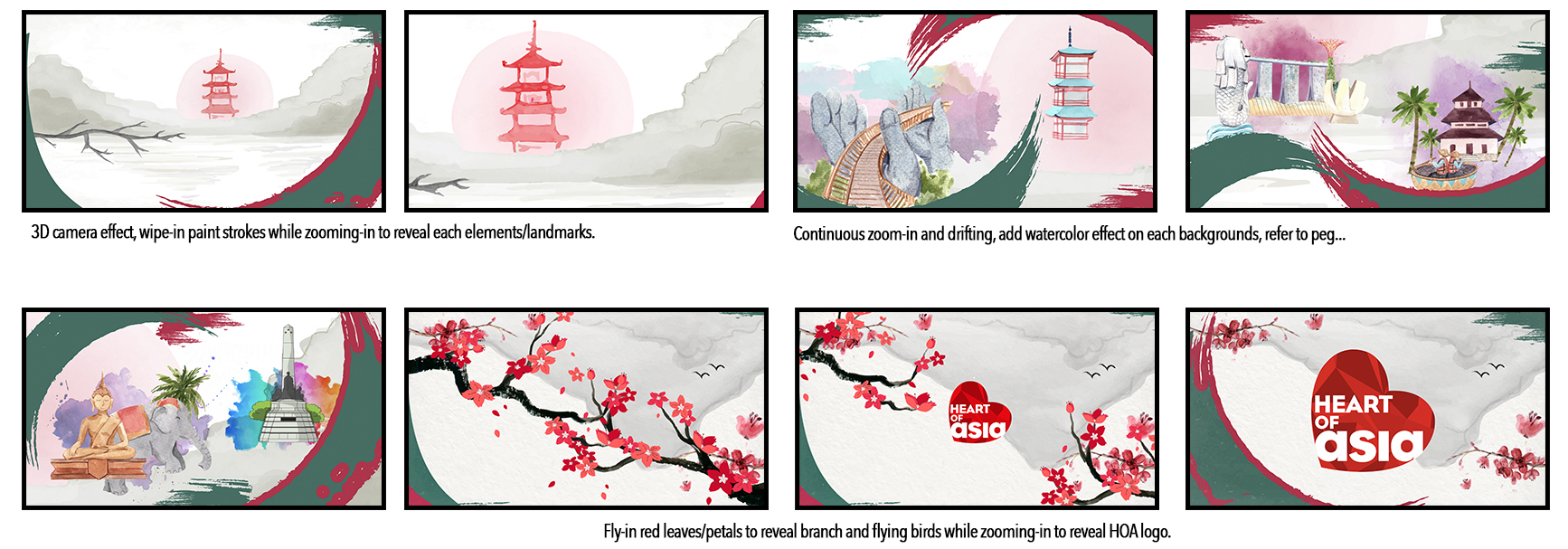
Motion Graphics:
Dynamic and immersive motion graphics are a hallmark of the Heart of Asia Channel’s identity. Transition animations between shows and segments feature intricate patterns, traditional motifs, and animated calligraphy that evoke the essence of Asian artistry. These animations provide a seamless and visually engaging viewing experience.
Icons and Symbols:
The identity incorporates a collection of culturally significant icons and symbols, such as lotus flowers, lanterns, and traditional musical instruments. These symbols are used as visual cues to signify different program genres and themes, making it easy for viewers to navigate the channel’s diverse content.